Published On Mar 5, 2024
Learn the first steps to optimize any spreadsheet: https://www.excelpowerup.com/training
Take your Excel spreadsheets to the next level: https://www.excelpowerup.com/course
Get personalized professional support: https://www.excelpowerup.com/support
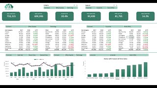
Do you want to make sense of your data with a dashboard? You don't need to spend hours on it or make it too complicated! Sometimes, less is more when it comes to presenting your data clearly and effectively. In this video, I will show you how to build a simple and sleek dashboard in just three easy steps. I will also point out some common pitfalls you may encounter when creating your first dashboard and how to avoid them.
Website: https://www.excelpowerup.com
Instagram: / rebekahoster
TikTok: / rebekahoster
LinkedIn: / rebekah-oster
00:00 Introduction
00:46 Create Excel Table
02:08 Change Workbook Theme
02:50 Mistake #1: Individual Element Formats
04:20 Mistake #2: Using Gridlines
05:07 Create Canvas
05:43 Hide Rows and Columns
06:41 Build Elements on Separate Sheet
07:16 Insert Slicer
08:03 Linked Picture
09:43 Smart Art to Display Data
12:23 Design Dashboard
13:25 Final Tweaks
14:21 Mistake #3: Too Many Elements