Riffomonas Project
24.9K subscribers
1:11:35
Making a waffle chart in R with the tidyverse to assess proposals for cutting the US budget (CC358)
Riffomonas Project
1.1K views • 1 month ago
56:27
Exploring the volatility of the S&P under Trump using the quantmod and tidyverse R packages (CC357)
Riffomonas Project
1.1K views • 2 months ago
54:48
Showing the change in US death rate since before the COVID-19 pandemic with R's tidyverse (CC356)
Riffomonas Project
1.1K views • 2 months ago
54:08
Plotting a regression line on a scatter plot of smoking and drinking data with ggplot2 (CC355)
Riffomonas Project
811 views • 2 months ago
51:12
Scraping the web with R to create NY Times plot of March Madness Championship viewership (CC354)
Riffomonas Project
1K views • 3 months ago
50:40
Visualizing the The Economist's Glass Ceiling Index in R with ggplot2 and ggborderline (CC353)
Riffomonas Project
761 views • 3 months ago
32:21
Replacing a stacked bar plot with a dot plot in R with ggplot2 (CC352)
Riffomonas Project
879 views • 3 months ago
50:42
Recreating a sentiment analysis visualization from the Pew Research Center in R with ggplot2 (CC351)
Riffomonas Project
827 views • 3 months ago
39:47
Recreating a stacked barplot from the Pew Research Center in R with ggplot2 (CC350)
Riffomonas Project
887 views • 3 months ago
39:21
Recreating a NYT heatmap of deaths by drug overdoses in R with ggplot2 (CC349)
Riffomonas Project
554 views • 3 months ago
59:28
How to extract data from a heatmap with R using the tidyverse (CC348)
Riffomonas Project
1.1K views • 3 months ago
45:35
How to recreate a historic map in R using the sf and ggplot2 packages (CC347)
Riffomonas Project
1K views • 3 months ago
51:17
How to draw braces to annotate a bar plot in R using ggplot2 (CC346)
Riffomonas Project
786 views • 4 months ago
52:16
How to create a serperntine bar plot using R and ggplot2 to recreate a DuBois data portrait (CC345)
Riffomonas Project
567 views • 4 months ago
56:28
How to recreate DuBois's spiral plot from the 1900 Paris Exposition using R and ggplot2 (CC344)
Riffomonas Project
474 views • 4 months ago
46:49
How to recreate DuBois's bullseye plot from the 1900 Paris Exposition using R and ggplot2 (CC343)
Riffomonas Project
398 views • 4 months ago
52:55
How to recreate WEB DuBois's fan plot from the 1900 Paris Exposition using R and ggplot2 (CC342)
Riffomonas Project
548 views • 4 months ago
28:23
How to recreate a WEB DuBois area plot from the 1900 Paris Exposition using R and ggplot2 (CC341)
Riffomonas Project
416 views • 4 months ago
52:15
How to recreate WEB DuBois's Panel 12 from the 1900 Paris Exposition using R and ggplot2 (CC340)
Riffomonas Project
743 views • 4 months ago
36:28
Using gganimate to animate changes in life expectancy and health care spending with R (CC339)
Riffomonas Project
1.1K views • 4 months ago
54:44
Using ggplot2 to visualize relationship between life expectancy and health spending in R (CC338)
Riffomonas Project
1.6K views • 5 months ago
48:55
Using dplyr & ggplot2 to make kindergarten vaccination rates a bit more interesting with R (CC337)
Riffomonas Project
760 views • 5 months ago
49:32
Visualizing changes in kindergarten vaccination rates with dplyr and ggplot2 in R (CC336)
Riffomonas Project
851 views • 5 months ago
44:30
Using readxl and dplyr to format messy data to see change in poverty with R (CC335)
Riffomonas Project
1.3K views • 5 months ago
59:45
Using ggplot2 to quantify the change in the US poverty rate over the last 65 years in R (CC334)
Riffomonas Project
1.1K views • 5 months ago
42:12
Positron or RStudio? First time Positron user creates scatter plot with R's ggplot2 package (CC333)
Riffomonas Project
4.3K views • 5 months ago
34:45
Recreating a New York Times bar chart using the ggplot2 R package (CC332)
Riffomonas Project
1.1K views • 5 months ago
42:40
Recreating a side-by-side line plot from CNN using patchwork and ggplot2 in R (CC331)
Riffomonas Project
602 views • 5 months ago
44:52
Creating side-by-side line plots with ggplot2's facet_grid function in R (CC330)
Riffomonas Project
616 views • 5 months ago
47:22
Visualizing polling bias from the 2024 US presidential election in R with ggplot2 (CC329)
Riffomonas Project
968 views • 6 months ago
Load More

 1:11:35
 56:27
56:27 54:48
54:48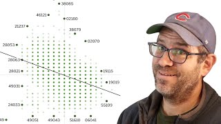 54:08
54:08 51:12
51:12 50:40
50:40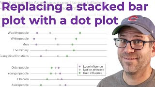 32:21
32:21 50:42
50:42 39:47
39:47 39:21
39:21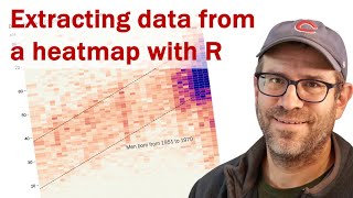 59:28
59:28 45:35
45:35 51:17
51:17 52:16
52:16 56:28
56:28 46:49
46:49 52:55
52:55 28:23
28:23 52:15
52:15 36:28
36:28 54:44
54:44 48:55
48:55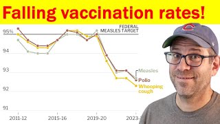 49:32
49:32 44:30
44:30 59:45
59:45 42:12
42:12 34:45
34:45 42:40
42:40
