Published On Jul 1, 2023
Learn how to make use of Lightrooms Split Toning tool to create intense colors for your landscape photos!
You can follow along this Lightroom Tutorial by downloading the raw photo here:
https://drive.google.com/file/d/1VUv1...
▬▬▬▬▬▬▬▬▬▬▬▬▬▬▬▬▬
Thank you for watching my video!
► http://www.the-phlog.com
► Patreon: / phlog
► Instagram: / thephlog
Below you'll find affiliates links to gear I personally use every day when photographing. These are products I believe in.
► My Camera https://amzn.to/48faXok
► Mount Converter https://amzn.to/3tuaM9F
► 16-35mm (CANON) https://amzn.to/4axZh1x
► 24-105mm (CANON) https://amzn.to/3tDlPx6
► 70-300mm (SIGMA) https://amzn.to/3RYfeqE
► Tripod https://amzn.to/3GZG9fu
▬▬▬▬▬▬▬▬▬▬▬▬▬▬▬▬▬
0:00 intro
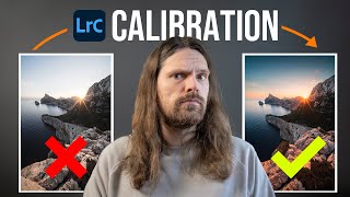
For this photo I wanted to create a sunset / golden hour scene with very intense colors. Of course not everyone is going to like this well saturated look, but I think it fits the scene quite well. The cool thing is those colors were introduced using a combination of white balance settings and split toning in Lightroom Classic.
0:16 1. Basic Adjustments
Before working with split toning its important to set up the base image. We need to restore highlights in order to apply nicely visible colors to them! So, first, I brought down the highlights and raised the shadows to balance the exposure. I also slightly increased the whites to not loose too much contrast. For sharper details I raised the texture while I lowered the clarity to apply a soft look overall. Once the exposure was balanced, I worked on the white balance. To give it a golden hour look I heavily brought up the temperature.
2:26 2. Masking
A few things had to be adjusted locally. For example, I wanted the top part of the sky to be darker with a blue color. Here, I used a linear gradient to bring down the exposure and also the temperature to reintroduce some of the blue tones. I also placed a linear gradient over the foreground adding a bit of clarity and dropping the exposure giving the foreground more detail and a subtle vignetting effect.
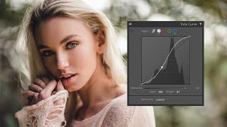
4:26 3. Split Toning
To give the image very intense, warm colors, I added a warm hue for the highlights and pushed up the saturation all the way. Again, this comes down to personal taste since it’s a very hefty change. To further work on the warm tones, I added a warm hue to the mid-tones and brought up the saturation quite a bit as well. To have some contrasting colors, I used the shadows to apply a cold color with a low amount of saturation.
4. Photoshop
I cleaned up the image and added some orthon glow on top of it with the gaussian blur filter and the lighten blending mode.