Published On Jan 13, 2020
Practice your Python Pandas data science skills with problems on StrataScratch!
https://stratascratch.com/?via=keith
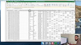
In this video we use Python Pandas & Python Matplotlib to analyze and answer business questions about 12 months worth of sales data. The data contains hundreds of thousands of electronics store purchases broken down by month, product type, cost, purchase address, etc.
Setup!
Github source code & data: https://github.com/KeithGalli/Pandas-...
Installing Jupyter Notebook: https://jupyter.readthedocs.io/en/lat...
Installing Pandas library: https://pandas.pydata.org/pandas-docs...
Check out the first video I did on Pandas:
• Complete Python Pandas Data Science T...
Check out the videos I did on Matplotlib:
• Intro to Data Visualization in Python...
• Python Plotting Tutorial w/ Matplotli...
Detailed video description! (timeline can be found in comments)
We start by cleaning our data. Tasks during this section include:
- Drop NaN values from DataFrame
- Removing rows based on a condition
- Change the type of columns (to_numeric, to_datetime, astype)
Once we have cleaned up our data a bit, we move the data exploration section. In this section we explore 5 high level business questions related to our data:
- What was the best month for sales? How much was earned that month?
- What city sold the most product?
- What time should we display advertisemens to maximize the likelihood of customer’s buying product?
- What products are most often sold together?
- What product sold the most? Why do you think it sold the most?
To answer these questions we walk through many different pandas & matplotlib methods. They include:
- Concatenating multiple csvs together to create a new DataFrame (pd.concat)
- Adding columns
- Parsing cells as strings to make new columns (.str)
- Using the .apply() method
- Using groupby to perform aggregate analysis
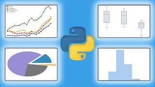
- Plotting bar charts and lines graphs to visualize our results
- Labeling our graphs
If you enjoy this video, make sure to leave it a like and subscribe to not miss any future similar tutorials :).
Check out the new "solving real world data science tasks" video I posted!
• Solving real world data science tasks...
---------------------------------------------
Follow me on social media!
Instagram | / keithgalli
Twitter | / keithgalli
---------------------------------------------
Video Timeline!
0:00 - Intro
1:22 - Downloading the Data
2:57 - Getting started with the code (Jupyter Notebook)
Task #1: Merging 12 csvs into a single dataframe (3:35)
4:25 - Read single CSV file
5:44 - List all files in a directory
7:06 - Concatenating files
11:00 - Reading in Updated dataframe
Task #2: Add a Month column (12:48)
14:12 - Parse string in Pandas cell (.str)
Cleaning our data!
17:31 - Drop NaN values from df
21:25 - Remove rows based on condition
Task #3: Add a sales column (24:58)
25:58 - Another way to convert a column to numeric (ints & floats)
Question #1: What was the best month for sales? (29:20)
30:35 - Visualizing our results with bar chart in matplotlib
Question #2: What city sold the most product? (34:17)
35:32 - Add a city column
36:10 - Using the .apply() method (super useful!!)
40:35 - Why do we use the lambda x ?
40:57 - Dropping a column
46:45 - Answering the question (using groupby)
47:34 - Plotting our results
Question #3: What time should we display advertisements to maximize the likelihood of purchases? (52:13)
53:16 - Using to_datetime() method
56:01 - Creating hour & minute columns
58:17 - Matplotlib line graph to plot our results
1:00:15 - Interpreting our results
Question #4: What products are most often sold together? (1:02:17)
1:03:31 - Finding duplicate values in our DataFrame
1:05:43 - Use transform() method to join values from two rows into a single row
1:08:00 - Dropping rows with duplicate values
1:09:39 - Counting pairs of products (itertools, collections)
Question #5: What product sold the most? Why do you think it did? (1:14:04)
1:15:28 - Graphing data
1:18:41 - Overlaying a second Y-axis on existing chart
1:23:41 - Interpreting our results
---------------------
If you are curious to learn how I make my tutorials, check out this video: • How to Make a High Quality Tutorial V...
Join the Python Army to get access to perks!
YouTube - / @keithgalli
Patreon - / keithgalli
*I use affiliate links on the products that I recommend. I may earn a purchase commission or a referral bonus from the usage of these links.