Published On Mar 25, 2019
Template here: https://osf.io/ef53g/ | Examples on Twitter: / mikemorrison
Every field in science uses the same, old, wall-of-text poster design. If we can improve the knowledge transfer efficiency of that design even by a little bit, it could have massive ripple effects on all of science.
Also, poster sessions tend to suck, so here's my pitch to make them more efficient AND more fun with a new approach to designing scientific posters/academic posters that is both more usable, and easier to create!
MY TWITTER (tag me in me your poster selfies!!):
/ mikemorrison
PORTRAIT LAYOUT (alpha version)...
https://osf.io/g6xsm/
WAIT NEVERMIND: Ignore what I said about colors. Instead, use colors that trigger the right emotions to fit your punchline, when possible. Failing that, use colors that complement/repeat colors from a key graphic/image. Try to do something above defaulting to your school's bg color.
FAQ: HOW DID YOU MAKE THIS VIDEO?
I started in (http://Vyond.com), which made concepting super fast and easy. Then I threw everything on a green background and did extra stuff in Adobe After Effects. If you want to make a video like this for yourself, I cannot recommend starting in Vyond highly enough. You can get started with ZERO video experience, and be having fun & making stuff within 5 minutes. It's like a gateway drug for animating.
FAQ: BUT IT'S MISSING [WHATEVER] THING I NEED
Add it! As in the video, I was aiming for a minimal base, with nothing to take away. There's plenty of stuff that can be added. Got an idea? Modify it and let me know how it goes! This is not the only way to do a poster well, nor is it perfect in all cases. Just one suggestion that, I think, is at least a step in the right direction from the wall of text. You can take it way further. It's more important that you experiment with lots of ideas than 'decide' on one layout.
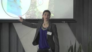
FAQ: BUT MY FIELD IS VISUAL. I NEED A WALL OF VISUALS AND TEXT
In my experience, visual fields (e.g., org chem, robotics, planetary science) can actually go even more minimalist than this standard #betterposter layout. If that's you, think of your poster as a very brief visual story, that can be absorbed from 6 feet away. See how few images & sentences you can use to communicate your key methods and results.
THANKS
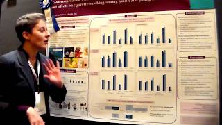
Special thanks to my fellow IO Psychologist friend Jacob Bradburn ( / jacobbradburnio ) for martyring his otherwise-perfectly-fine traditional academic poster for the cause....and also for letting me steal his "Woodstock for geeks" joke.
Also thanks to Sergio M at MSU ( / powersergg_ ) for picking the intro music!